One of biggest names in the luxury automobile industry redesigns its iconic logo.
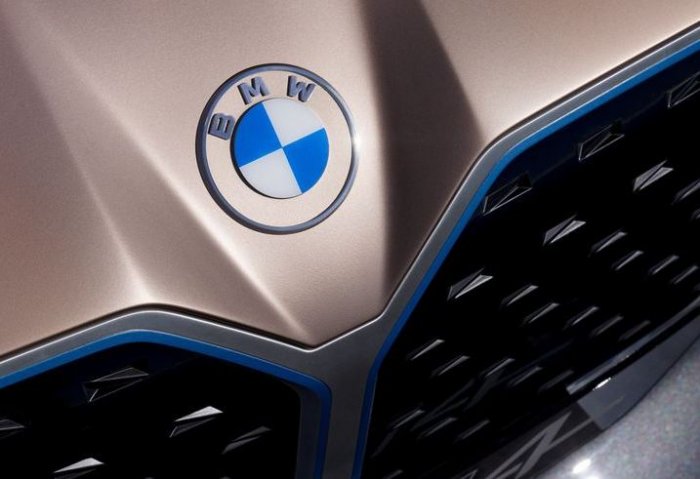
German multinational car company Bayerische Motoren Werke AG, better known as BMW, will replace its distinct circular logo with a new design that is lighter and flatter than the roundel it last updated in 1997. For the first time in the company’s 103-year history, BMW’s logo will feature a transparent circle around its blue and white ring rather than a black one.
The new logo will only be used in the company’s communication efforts, including in its website and social media platforms.
“BMW becomes a relationship brand. The new communication logo radiates openness and clarity,” Jans Thiemer, BMW Senior Vice President of Customer and Brand, said in an article on the history of the logo on the company's website. “With this new transparent variant, we want to invite our customers more than ever to become part of the BMW world. In addition, our new brand design is geared to the challenges and opportunities of Digitization for brands”.
Thiemer added the new communication logo “symbolizes the significance and relevance of the brand for mobility and driving pleasure in the future”.
Although the new logo appeared on the hood of BMW Concept i4 electric vehicle, which made its debut on Tuesday, the company has no further plans for the new logo to appear on production vehicles.
Blue and white is often thought to be a spinning propeller, to honor BMW's aircraft-engine beginnings, but BMW in the article on the history of the logo says the “BMW badge display the state colors of the State of Bavaria-white and blue”.
BMW's previous logo debuted in 1997. The company has had six similar looking logos in its 103-year-old history.


